The 2026–2028 In Colors Just Dropped — Let's Talk About It
The new 2026–2028 In Colors have arrived, and I have thoughts. Many thoughts. Let's go:
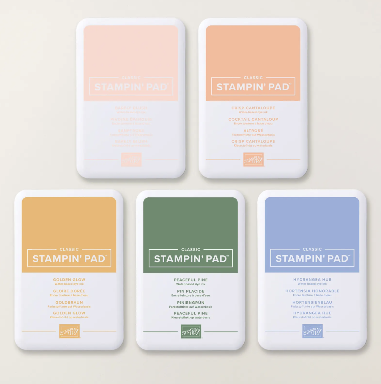
🌸 Barely Blush: the quiet one at the party who turns out to be the most interesting person in the room
💙 Hydrangea Hue: periwinkle perfection. That's it. That's the review.
🌟 Golden Glow : warm, glowy, buttery. Cannot wait to pair this with Peaceful Pine and call it autumn.
🍑 Crisp Cantaloupe: this color is basically a vacation
🌲 Peaceful Pine: the grown-up green your card front has been asking for
Do they all work together? Yes. Embarrassingly well. You can grab any two of these and make a card that looks like you thought about it for hours.
Now let's talk about the ink pads, because they're getting a glow-up too.
Starting with this In Color release, Stampin' Up! is rolling out a brand-new ink pad design. Not a huge visual overhaul; more like someone sat down and said, "What are crafters actually annoyed about? Let's fix that."
Here's the short list:
Magnet-based, stackable cases: your pads will stop doing interpretive dance in the drawer
Magnetic snap-tight closure: opens easy, stays shut, won't ghost you mid-project
More ink per pad: longer life before a refill
Important: You do NOT need to replace your existing pads. Your current ink pads still work perfectly, and the new design is rolling out gradually through 2027. So yes, for a while, you'll have a charming mix of old and new styles living together in your stamp drawer. It's fine. It's good, even. They're all family.
Enough about the packaging — the colors are the main event. Let's go make something gorgeous!
💕 Lynsay